The Different Views in FamilySearch Family Tree
The traditional, portrait, fan chart, and descendancy views in Family Tree
There are now four different views available from the FamilySearch Family Tree program. These are: Descendancy, Fan Chart, Portrait and Traditional. Each of the views has its adherents, but the new Descendancy view shows the most promise for a practical approach to working through the program.
Here is a summary of my thoughts on each of these views:
Traditional View
This view is only traditional from the standpoint that experienced genealogists recognize this as a simplified pedigree chart. It is relatively difficult for newcomers to the program to understand what they are looking at. I find that most of the people who see this view for the first time do not understand that the female line branches off from the bottom of the name boxes. Here is a screenshot with the lines emphasized for effect.
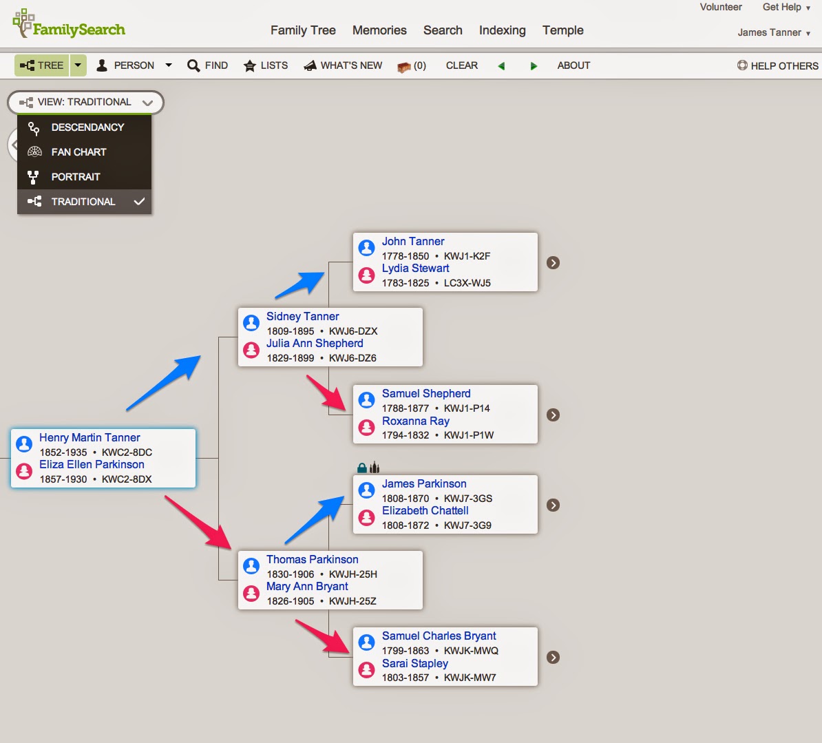
This view does give a lot of information about the families, especially if you hover over the boxes with your mouse. But it is easy to get lost. All of the views are connected to the Detail View of each individual. But it is difficult here to get to one of the children of any of the families shown without clicking on an individual to see the Details View. For example, I could hover over Henry Tanner to see his wives, but clicking on the down arrow to see the children, only shows the children for the wife showing in the main box. Here is an example from a screenshot.
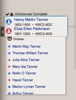
If I want to see the children of a different wife, I have to figure out how to show her, rather than the wife that is visible. The visible wife is the preferred selection.
This is just one of the issues with working with the traditional view. Otherwise, it is a good way to navigate through your pedigree, assuming of course, that you have a good understanding of your family relationships to begin with.
Portrait View
The Portrait View has even more of the same limitations as the Traditional View. Here is a screenshot showing this view.
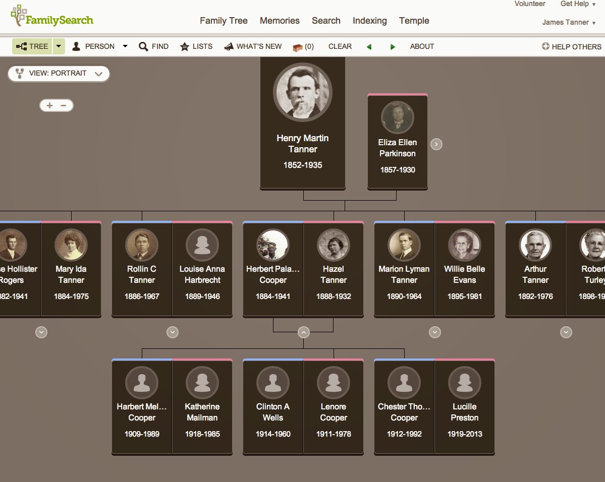
This is what most people with no experience in genealogy think of when they think of a graphic representation of a family tree. It is very cumbersome to navigate and shows much less information about the families and individuals than the Traditional View. It is graphic and easily understood by most beginners but can be difficult to use for entering names and information about the family. Again, clicking on any individual's box, will bring up the same Detail View. Here is an example of the Detail View.
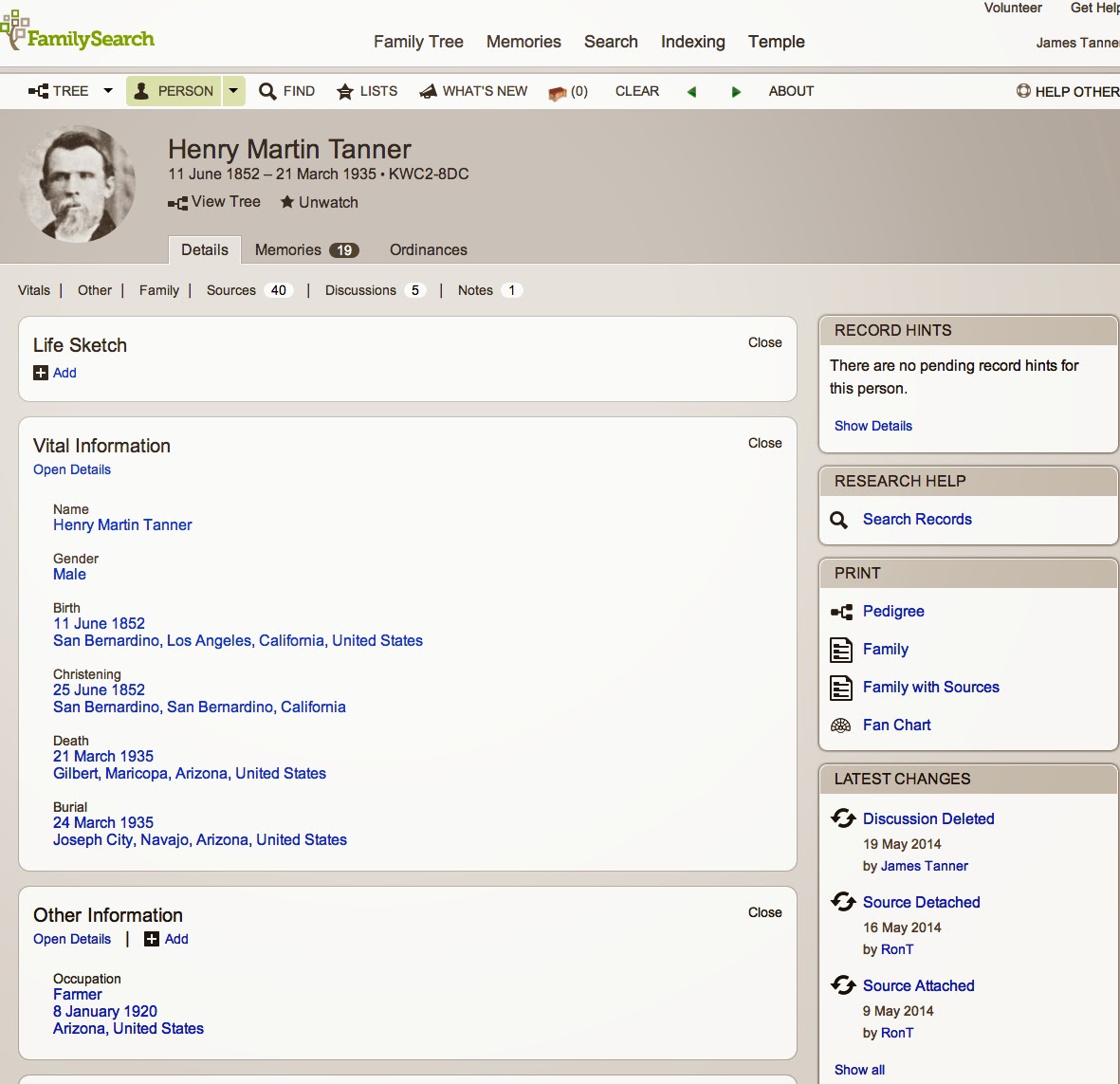
Initially, the beginner does not know what to do with this Detail View page. Mainly, they do not realize that most of the information about the individual is not showing and they must either click on fields or scroll to see more information.
Fan Chart
This Fan Chart View is a popular way of depicting the ancestral family tree. You either like it or you don't. I don't like this view because of the fact that people tend to focus on missing ancestors. As with all the views in Family Tree or any other family tree program, if the connections and relationships of the ancestral lines are not accurate all of the views give false information. The Fan Chart View gives the least amount of information of any of the Family Tree views. Here is an example:
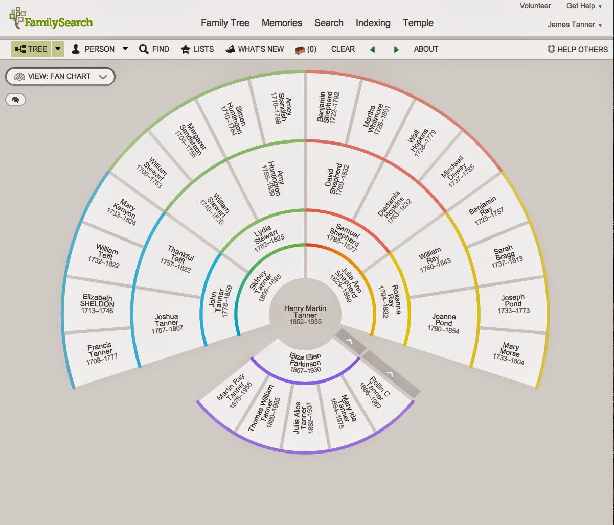
Just as with the other views, clicking on any one of the names will bring up the Details View page for that individual. It has the same limitation as the other previously mentioned views in that it shows only the preferred wife and parents.
Descendancy View
By far the best innovation so far in Family Tree is the Descendancy View. The first and most important issue here is that this view shows all the wives and all the children of an individual. It also coveys a lot more, but very different, information about the individuals and the families. Here is a screenshot.
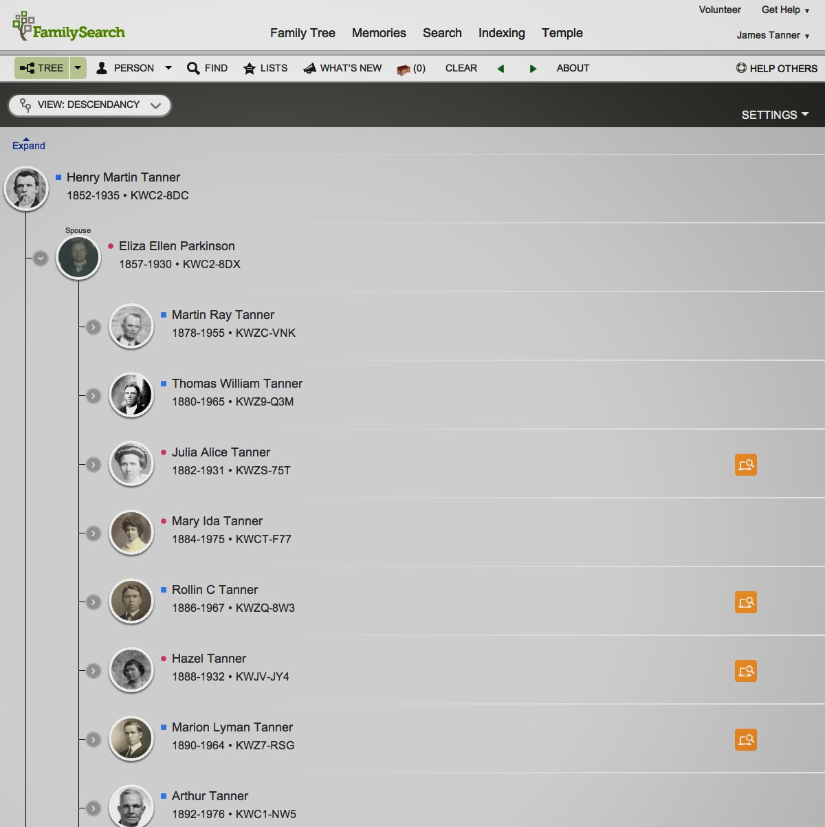
This view may take some getting used to. It is outside the general pattern familiar to many genealogists and most beginners. But it has some features that make it the most practical way to view and use the Family Tree program. First, is the addition of four types of information, some available only to members of The Church of Jesus Christ of Latter-day Saints. These are: Request Ordinances, Record Hints, Research Suggestions and Data Problems. Here is a screenshot of the Settings box where this list is located.
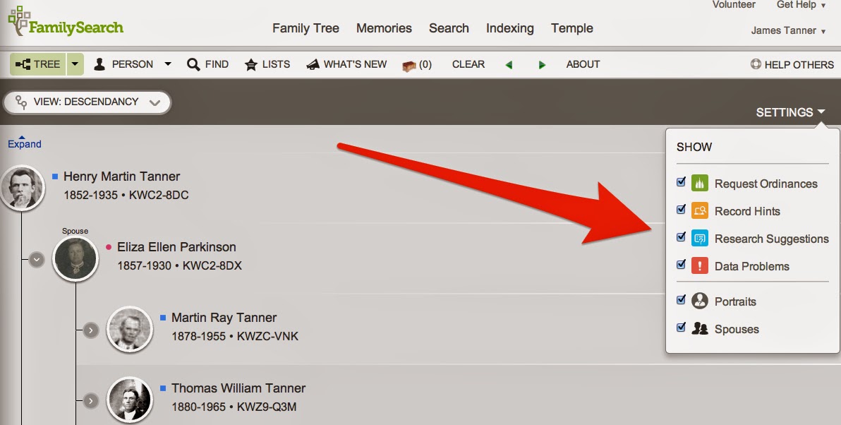
I would strongly suggest leaving all those items checked as they appear by default.
You can navigate through the families by clicking on the Expand link. Here is a screenshot with an arrow showing the link, followed by another screenshot showing the navigational screen that results.
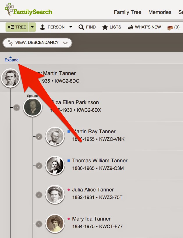
Here is the result of clicking on the Expand link.
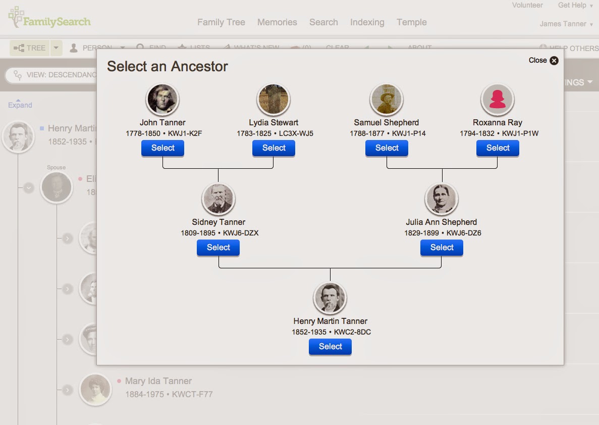
You can now move up and down through your ancestors. You move down, by clicking on a child in the Descendancy View. You move up or back in time, by clicking on one of the ancestors shown in this view.
I think you will find that because of extra information shown in this view, it will become the most practical way to work on your ancestry.
Written by James L. Tanner. Used with permission.
Need help finding more records? We have genealogy research services available. You can also try our genealogical records directory which has more than 1.3 million sources to help you more easily locate the available records.
Related Topics
- Learning Genealogy Articles more than 140 helpful articles to help you to do genealogy more effectively
- Unique Features of the FamilySearch Family Tree A brief summary of the unique features of Family Tree
- Cautions in Using Family Tree Some potential issues to be aware of when using the FamilySearch Family Tree
- How to Use FamilySearch Family Tree Effectively Why it's important to add sources